工欲善其事,必先利其器

At the beginning of this month, in the morning of deadline for VLDB, I got stuck for hours just to draw “good” figures for our experiment parts. The reason is that I haven’t used Matlab for quit a long time, so I totally forgot many things. As a lesson, I think I need to write down some notes here. Since Matlab really gave me awful experience, I decide to turn to python.

First of all, we need numpy and matplotlib.
Acually, what I need are just 2D bars and lines. So I would just keep nodes for these two. we use pyplot, which provides a MATLAB-like plotting framework.

Talk is cheap, show me your code.

bar

1
2
3
4
5
6
7
8
9
10
11
12
13
14
15
16
17
18
19
20
21
22
23
24
25
26
import numpy as np
import matplotlib.pyplot as plt
N = 10
#I just make up all these numbers
menMeans = (20, 35, 30, 35, 27)
womenMeans = (25, 32, 34, 20, 25)
oldMeans = (23, 30, 34, 24, 31)
youngMeans = (25, 34, 32, 26, 29)
menStd = (2, 3, 4, 1, 2)
womenStd = (3, 5, 2, 3, 3)
oldStd = (3, 5, 3, 2, 3)
youngStd = (4, 2, 1, 2, 3)
ind = np.arange(0, N, 2) # the x locations for the groups
width = 0.35 # the width of the bars: can also be len(x) sequence
plt.figure(figsize=(8,4))
p1 = plt.bar(ind, menMeans, width, color='r', yerr=womenStd, hatch="|||", label='Men')
p2 = plt.bar(ind, womenMeans, width, color='y', bottom=menMeans, yerr=menStd, hatch="x", label='Women')
p3 = plt.bar(ind+width, oldMeans, width, color='w', yerr=oldStd, hatch=".", label='Old')
p4 = plt.bar(ind+width*2, youngMeans, width, color='w', yerr=youngStd, hatch="//", label='Young')
plt.ylabel('Scores')
plt.title('Scores by group and gender')
plt.xticks(ind+width*1.5, ('G1', 'G2', 'G3', 'G4', 'G5') )
plt.yticks(np.arange(0,81,10))
plt.legend(fontsize = 'medium', loc='upper right', borderpad=1, labelspacing=0.2, frameon=False)
#plt.show()
plt.savefig('bar.eps', format='eps', dpi=1000, bbox_inches='tight')

Then we could generate the following figure.
f1

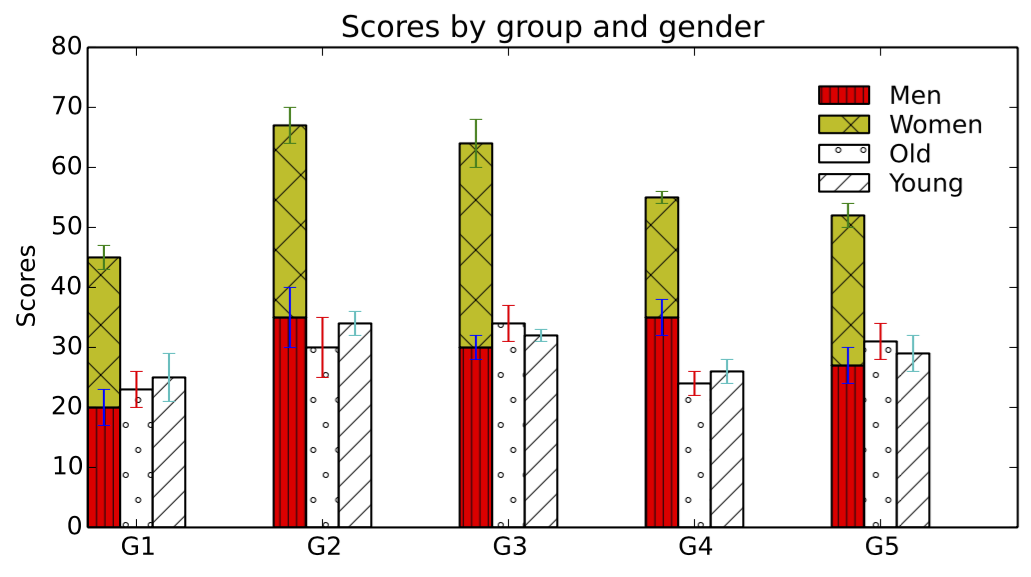
so as you can see, it is just like Matlab. pyplot provides

  • xlabel, ylabel, title
  • xticks, yticks
  • figsize, savefig
  • legend
  1. figsize specify the width and height of figure, and the default DPI is 80. While the default DPI for savefig is 100. so if you want to make plt.show() and plt.savefig look identical, you could pass fig.dpi to savefig.

    fig.savefig('temp.png', dpi=fig.dpi)